Creating a Concert Poster

For this project I’ve created a concert poster for the Romanian artist Inna. Part of this poster was created in Adobe Photoshop and Adobe Illustrator.
Step 1 Creating the background
To create the background, first I picked a picture of the artist and I transformed it to an outline shape using the Threshold from the Control Panel. Then I resized it and flipped it so it face to the right.

Next using a concert picture I found on Google, I resized it in order to bring out more the stage. Using the Saturation mode, I bring the blue’s and purple’s colors out. Next I placed the artist image on the left side of the document and changed the layer mode to Linear Burn.

Step 2 Creating The artist Image
I transformed the artist image into a cartoon or drawing by using the same process as the picture I used for the background. Next I painted the artist image using the Brush tool, I started by painting the the skin first, then the outfit, and then the hair. Once I finished painting, I saved them both. (The background image as a jpeg and the artist image as a png).

Step 3 Creating Artist Logo
For this step I used Illustrator. First I set the document size 8.5×11 with a bleed of 0.125.(Requirement). Next I placed the artist logo on my art board and trace it using the selection tool, rectangle tool, and Fill color.

Step 4 Placing the background and artist image
After tracing the logo and saving it, I placed the images I created on Photoshop.(Quick tip: Instead of dragging the images to the art board, placed them so Illustrator don’t link them).

Step 5 Creating the Info.
For the last step using the Type Tool I created the info boxes wich content is Date, Venue, Supporting Artist, Tickets Info, Address and Age restrictions. Next I brought the tracing of the logo to the front by using Arrange>Sent to the Front. And the last part, I placed the sponsor logo at the top of the art board.

Edward Mesias
Images I used for this Project.

![]()


Adobe Illustrator Classroom in a Book – Lesson 5

In this Lesson of the book I use the Pen Tool to create different lines and shapes in order to create objects.
Step 1
In the first assignment I have to connect anchor points using the Pen tool in order to have a zig zag line. Once the lines were connected I have to merge the middle lines to create a different shape.
 Step 2
In this next assignment Using the Pen tool, I have to create a different line pattern creating vertical, diagonal and horizontal lines. To create the Horizontal or Verticals lines correctly or perfectly align, I use the Shift key.
 Step 3
For this next assignment again using the Pen Tool and the Selection Tool, now I have to create curved lines and connect them. For the second part I’m going to use horizontal and curved lines.


Step 4
For the next assignment I have to create shapes that later on will be incorporated to the Violin. First I completed the Curved Line Exercise which I have to connect only to anchor points and by using the Direct Selection Tool and Pen Tool. The next exercise”Curved Shape”, again I have to connect the anchor points using the Pen Tool and the Direct Selection tool. Once all exercise were completed I have to dragged them using the Selection Tool and place them over the Violin.
 Step 5
This final step I have to fill the Violin shape with color using different patterns colors. For the Violin Neck, Chords, and Oval Shape I used a gradient color using dark grey and black. For the inside shape of the Violin I used a preset pattern that has orange and dark orange color in order to give the Violin a 2D effect.

Final Result

Edward Mesias
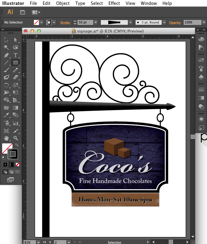
Creating a Business Sign on Adobe Illustrator

Step 1: Setting up the artboards
To create the business sign I need to create my working space. So first I go to Adobe Illustrator, then go to File>New. Now I’m going to rename the document “signage”. In the document also I set the number of Artboards to 2 and change the units to Inches.

Step 2: Drawing shapes and lines
Now I’m going to draw a line using the Line Segment Tool, I’m going to draw the line from the top left side of the art board to all the way down holding the Shift Key. Next I’m going to set the stroke size to 30 pt.

Now I’m going to draw a horizontal line in the middle of my black bar and set the stroke weight to 50 pt then set the “Y” value to 3.65 in. Using the Width tool I’m going to transform the black bar into a pointing bar. With the cursor on the right side of the bar I’m going to the path line, dragged up and change the width to 4 in. Now with the cursor to the left, I’m going to drag down to create the pointing shape.

Step 3: Placing the Spiral Figure
Now I’m going to place the spiral shape over the pointing bar, and next to the black bar so it gives it realistic effect. The spiral figure was provided by the Adobe Illustrator Lessons Files.
 Step 4: Creating the wood panel.
Using the Rectangle tool Im going to create a rectangle that has a width of 5.8 in and a height of 3 in. The stroke size should be 50 pt. I’m going to fill the rectangle with black color and the stroke with a light brown color. So now I’m going to apply some circular edges to the rectangle using the Ellipse tool. Next Im going to place a wood image provided by the Adobe Lessons folder and painted with a dark purple color. For the outer stroke I’m going to use black color and stroke width of 10 pt, for the inside stroke white color and same width 10 pt.
 Step 5: Working with type
Using the Type Tool, I’m going to type “Fine Handmade Chocolates” using Adobe Caslon Pro font and place it at the bottom of the rectangle. The text size should be 26 pt, the color is going to be white with an outside glow black.

Next I’m going to import the “Coco’s” image from the lesson’s file and place it above my text.

Step 6: Working with brushes
Using the Rectangle tool I’m going to create a small rectangle and place it under my big rectangle shape. From the brushes panel, I’m going to select the Mop Brush. I change the fill color to none and the stroke color to brown. Now with the Paintbrush tool Im going to paint inside the small rectangle to give it a wood effect. The size of the brush should be 4mm, Opacity 50% and the Stiffness 20%.
 Now In the small rectangle, using the Type tool I’m going to type “Hours Mon-Sat 10am-6pm” and place it in the center. The font should be Adobe Caslon Pro and the size should be 26 pt. The text color should be black, and white outer stroke.
 Step 7: Working with strokes
Now I’m going to create a chain looking shape with the Ellipse tool. The width should be 0.35, height 0.45 and the stroke weight 5 pt. With the Line Segment tool, Im going to draw a line that intersects the middle of the oval shape. Now in the control panel I’m going click the Round Cap button, select the Align Dashes to corners and type 75 pt into the dash field to create the chain effect. Using the Selection tool where are going to drag the chain shape to the right using holding the Option Key to duplicated.

Step 8: Working with perspective
Using the Perspective Grid tool I’m going to create a 3D box to make it appear as chocolates. So first I go to View> Perspective Grid>Two Point Perspective> 2P-Normal View. Now using the Rectangle Tool I’m going to create three rectangles in order to make them appear like a cube. Then I’m going to fill the cube with brown colors and place it in top of the Coco’s image. Then I duplicate the cube and make it smaller after I will have my chocolates effect.
Edward Mesias
Using the Pen Tool in Adobe Photoshop CS6

The Pen Tool in Adobe Photoshop can be one of the most difficult tools in Photoshop, but once we get use to it, it can be very helpful and can improve our workflow.
For my first assignment in class I was told to select the pear above using the pen tool, and after we should create a Red stroke. So I’m going to guide you step by step through the process, then in the final step which is save the image into TIFF file.
1) Open Your File in Photoshop
In order to work with Photoshop, we need to have a compatible format file that can be read in the software such as jpeg, gif, tiff, psd, pdf, png and others.
To open a file, go at the top menu bar in Photoshop, So we select File > Open> and we select the file we are going to work with in this case Pear.

2) Creating Layers
Once we opened the file, we notice that we have a new document with it own size and resolution. (We can change the size and resolution of the file anytime), in this case we will work with the original size and resolution.

After opening the file, in the layer menu, it will appear as BACKGROUND and also will be locked. So first, I need to unlock the layer and create a new one.
First I double-click on top of the background layer, a pop-menu will open asking to rename the layer. In this case I will name it PEAR. After I renamed it, I press OK button and it will automatically renamed and unlocked my layer.

Now I’m going to create a new layer an name it Background. So now, I should have two layers Pear and Background. Later I’m going to put the Background layer under the Pear layer. The reason I didn’t work directly with my original layer is because I always want to have the option to add color or a nice background to my project.
3) Using the Pen Tool.
Once I have created the Layers, it’s time to make a specific selection of the Pear using the Pent tool.
There is to ways to select the Pen Tool.
1. The Pen Tool is located at the left side on the tool bar. It has the shape of a pen.
2. Or we just press the letter “P” in the keyboard.
It’s time to start by placing the pen tool over any side of the Pear and start selecting in any direction until we have selected the entire Pear .

The objective of the Pen Tool is to select the Pear in a more precise way. The Pen tool will appear as I start selecting around the pear creating lines with selection points called Anchor points; which allows the pen tool to move and drag lines to any direction we want. After creating these lines we will have The Tangent line which controls the curvature of the curve. By adjusting the Tangent line we will have a more perfect selection, we just have to be patient and try to make it as perfect as possible.

Once we merge the lines, we have created a selection path (To see the Work Path created we go under Window > Path, it will appear at the right side at top of the layer section). This work path will allow us to work and edit inside this path, In this case I will add a red red stroke.
4) Adding a Stroke to the Path.
In order to add a stroke to the path we have to make sure that we are located in the Path section. But first I’m going to duplicate my Pear Layer. The reason I duplicate this layer is just in case I need to make a different adjustment later on. After Creating the new layer Pear Copy I select this layer and go to the Path section.


In the Path section I’m going to select the Load path as a selection button, which is located at the bottom of the path window. This button will select the entire path for us to edit. Once the Pear path is selected we go to the menu bar at the top and select Edit > Stroke. A window will pop-up asking for the size of the stroke and color, in this case I need a 3 px width stroke and red color.

Once we put the specific size and color to the stroke, we press ok and it automatically will create the stroke. To deselect the Pear we press Command+D.
5) Ready to Save.
To save in Tiff format we go to the top menu to File > Save As. In the format selection we select TIFF and the location where we want to save.

It’s always good to be organized, so I should recommend creating a new file named Pear and save the original Photoshop file as well as the TIFF format in case you need to use or edit the file in the future.
Pear

Edward Mesias

Recent Comments